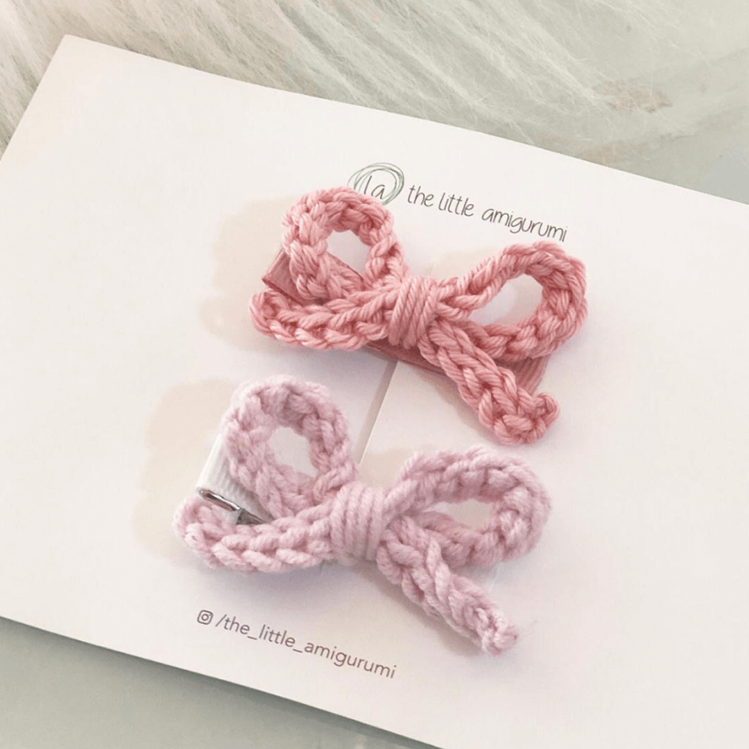
Of Japanese origin, Amigurumi (which translates loosely to ‘crocheted or knitted stuffed toy’) is an entirely manual work craft that anyone can learn with practice. However, due to its manual construction, each piece made from the same pattern becomes unique, creating a signature of its creator.
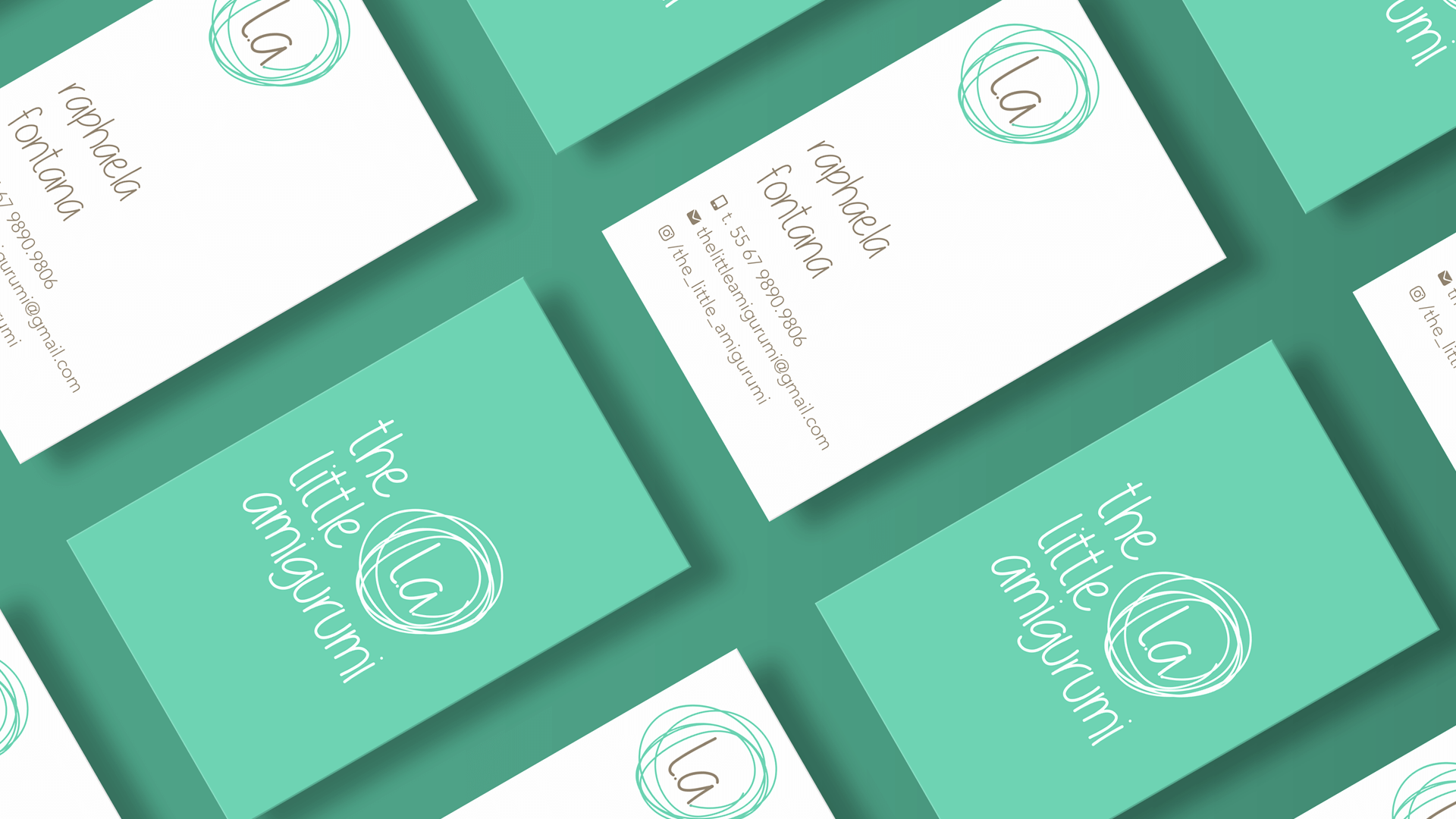
The brand The Little Amigurumi aimed to create an identity and logo that convey the professionalism and seriousness of the company, while preserving the playful and delicate essence of the crochet universe for children.
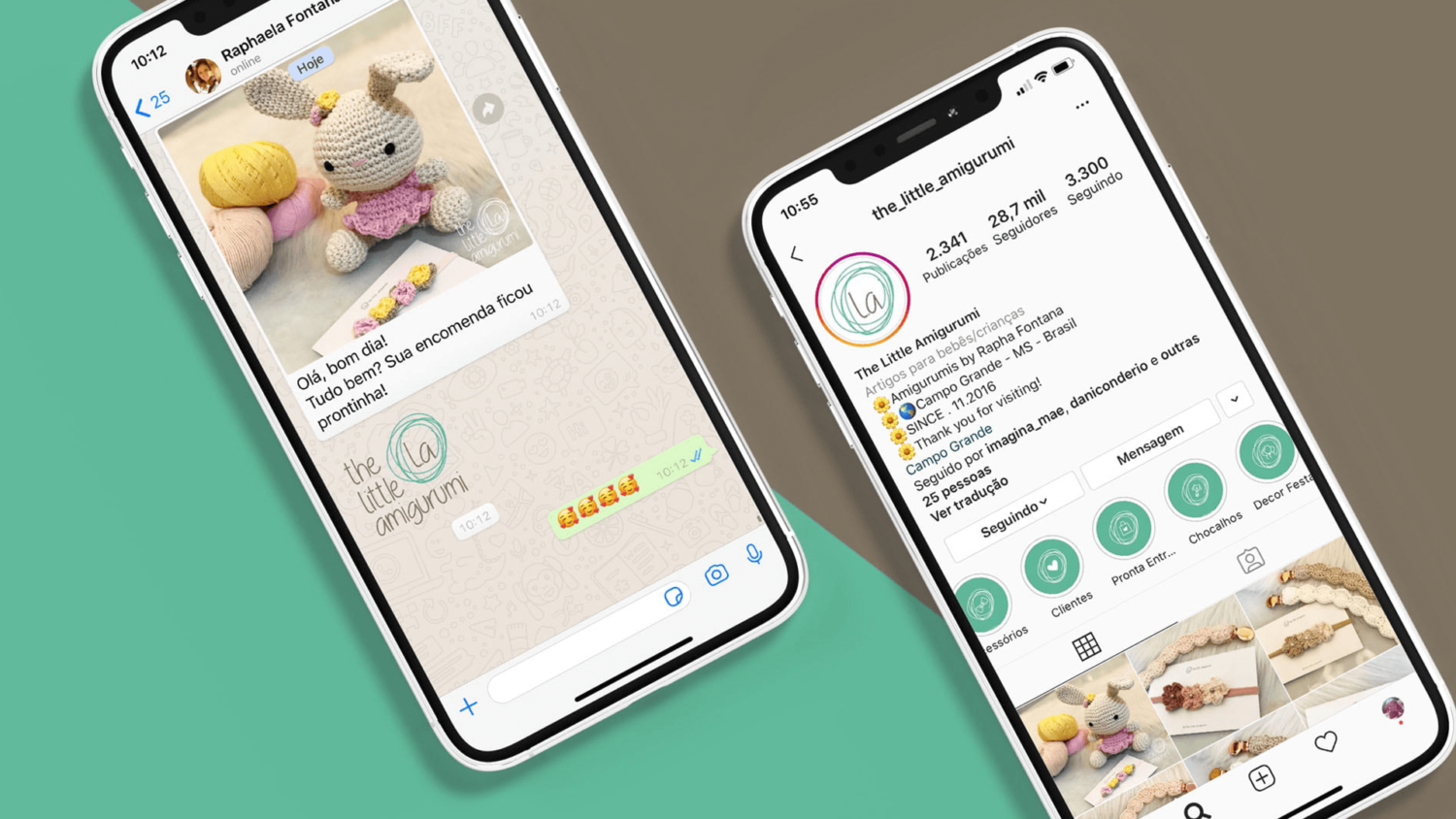
I delved deep into the realm of lines, colours, and textures while conducting a typographic exploration to capture the brand’s delicacy and playful essence. The brand’s visual identity is centred around a supporting element and a primary colour. Given its communication platform on Instagram, the logo is meticulously crafted to feature both vertical and horizontal signatures and alternative variations in addition to the iconic symbol.
The impact of The Little Amigurumi brand has garnered significant acceptance and customer loyalty. The emphasis on building strong customer relationships and receiving referrals has cultivated a desire for a “The Little Amigurumi” creation rather than just any toy, resulting in a waiting list spanning months.







Client Raphaela Fontana . Studio Sakada design . Designer Kryscila Mattos