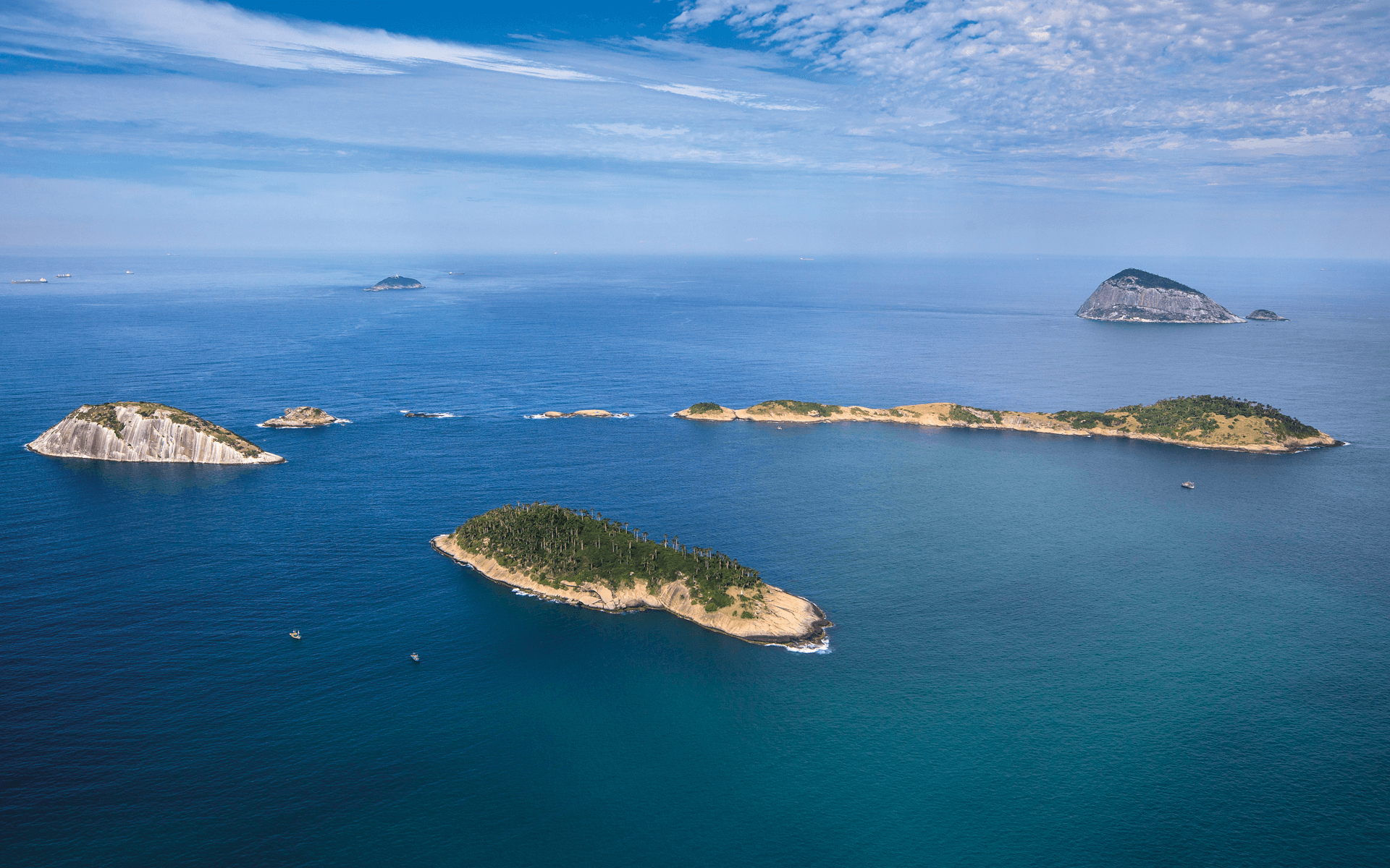
The Ilhas do Rio Project explores the cultures and ecosystems of the Cagarras islands around Rio de Janeiro. With episodes highlighting their local communities, stunning landscapes, and environmental challenges, the project aims to inspire appreciation and protection of these natural treasures. Partnerships with NGOs and private companies promote ecological conservation and sustainable development. At the same time, a visually engaging approach seeks to educate and entertain the audience, celebrating the cultural and natural diversity of the region.
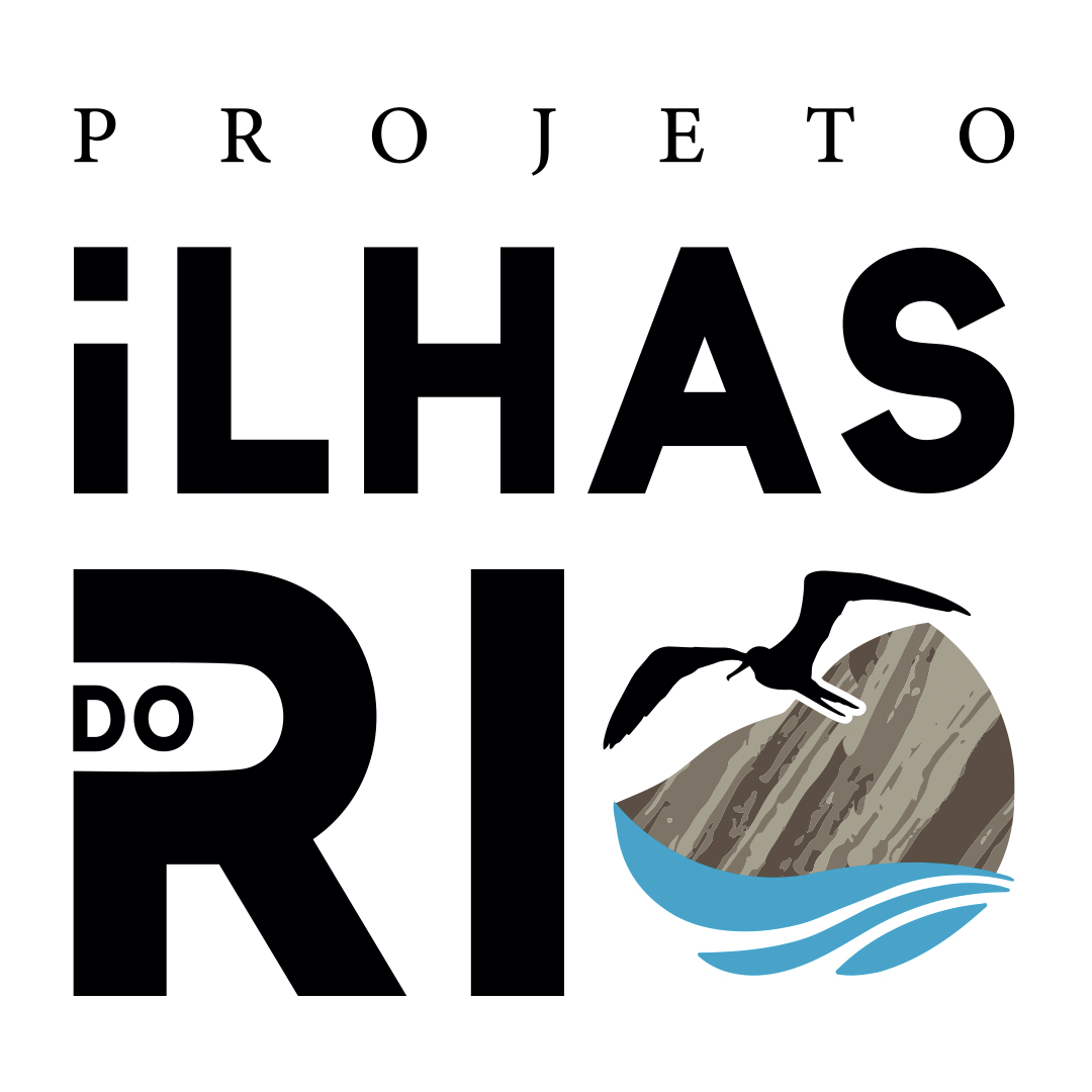
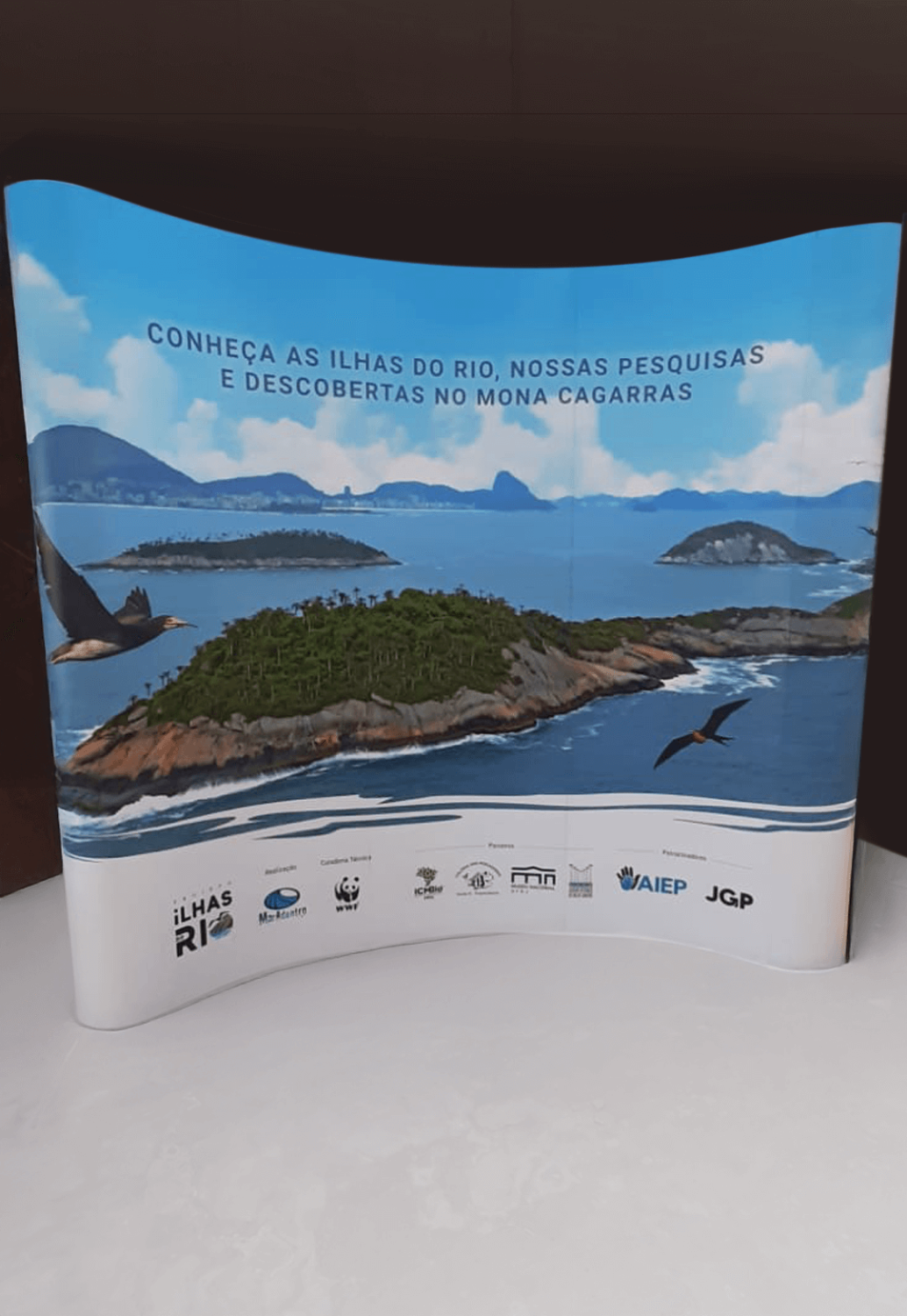
After ten years of operation, the Ilhas do Rio Project (PIR) recognized the need to redesign its logo and visual identity. This transformation aligned with a new strategic positioning for the organization and its brand. The main objectives were to enhance readability, visibility, and recognition across all online and offline touchpoints while ensuring adaptability for various printing processes.
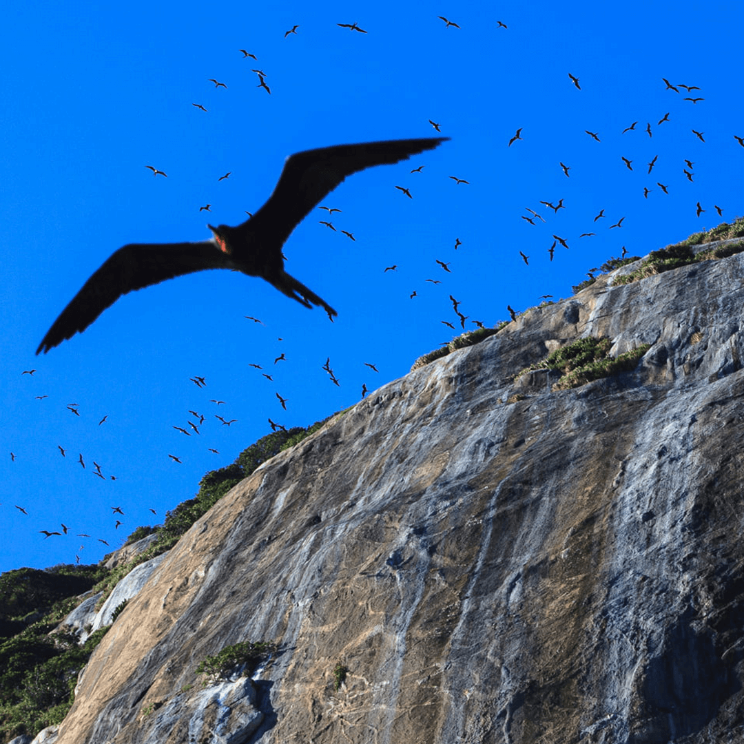
The rebranding process required a complete typography, structure, and graphic elements overhaul. A new icon was developed to represent the most distinctive and symbolic elements of the Cagarras Archipelago. The brand’s colour palette was carefully selected based on landscape analysis and studies to ensure accurate reproduction across different surfaces. The final design incorporated three key elements: a seagull, Cagarras Island, and ocean waves—each chosen for their strong visual identity and symbolic significance.
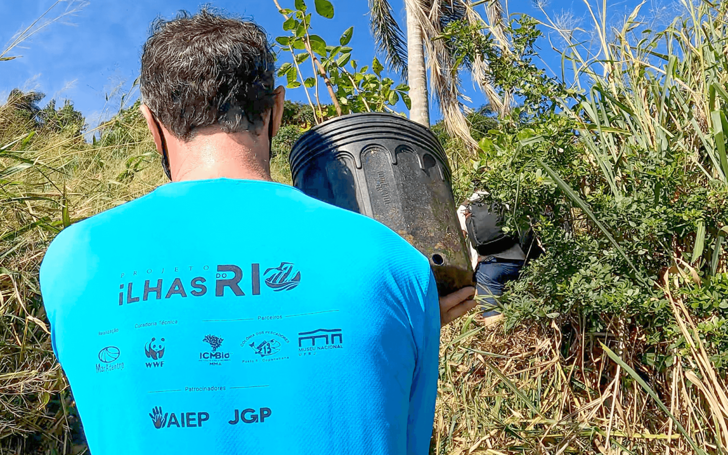
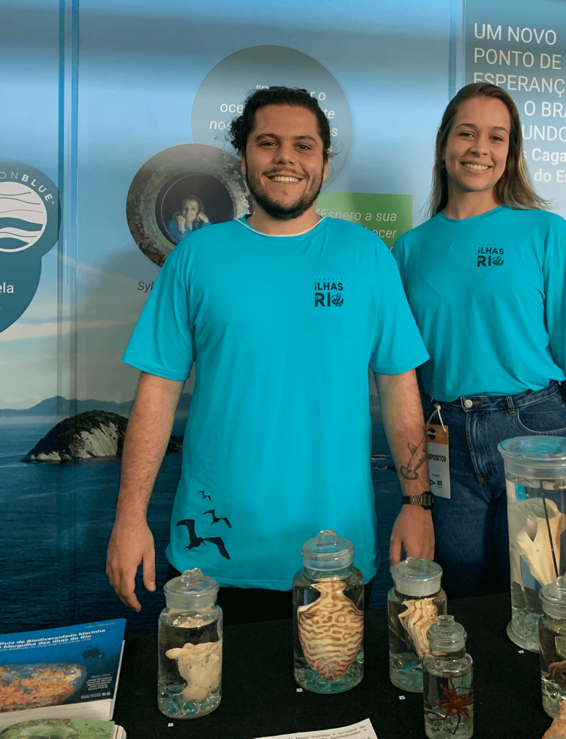
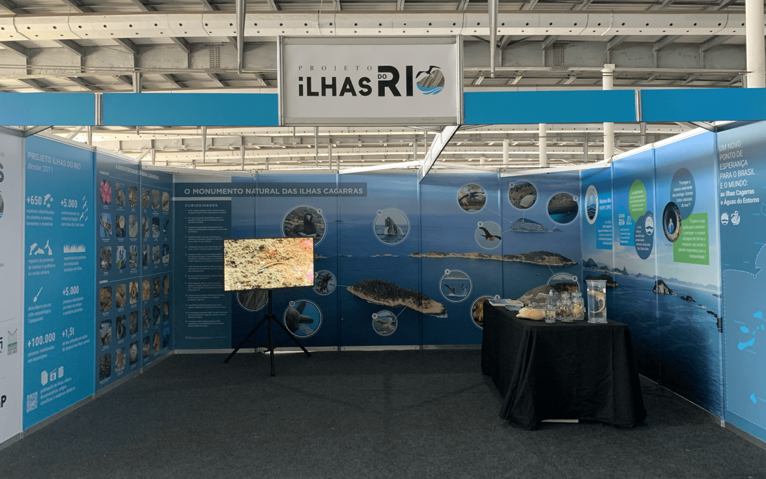
The new logo significantly improved visibility and prominence, especially when displayed alongside other brands and on various materials. Its versatility allows for application in full colour or monochrome without compromising readability or structure. The icon, which evolved into a hallmark of the brand, reinforces its identity and can be used both alongside the logo and as a standalone symbol.






Client Instituto Mar Adentro . Studio Sakada Design e Ideias . Art Director / Designer Kryscila Mattos . Designer Daryan Romanowisk